Best Lawyer Logos & Branding of 2020
NEW / The Best Lawyer Logos & Branding of 2021
Beam Local’s popular posts on the best lawyer websites from 2016, 2017, 2018, and 2019 have encouraged lawyers to build a beautiful, performance driven website for their legal practices. Looking for some inspiration for your new logo? We’ve searched the internet and handpicked the best lawyer branding of 2020.
Having a professional website is a great way to establish your law firm’s voice while attracting new clients. However, that is only one piece of the puzzle. Having a professional logo and branding is the most important way to ensure that your firm’s identity is cohesive across all platforms, from the web, to business cards and printed materials. Your clients choose a legal professional, and so your branding should portray that.
If you’re interested in having a new logo designed for your legal practice please get in touch for a free consultation with our team at Beam Local today.
Kyle Godon is a legal marketing expert.
He can help you get setup with a modern logo, branding or website. He’s personally helped over 128 lawyers. He’ll help you improve your practice.

Designed for The Future
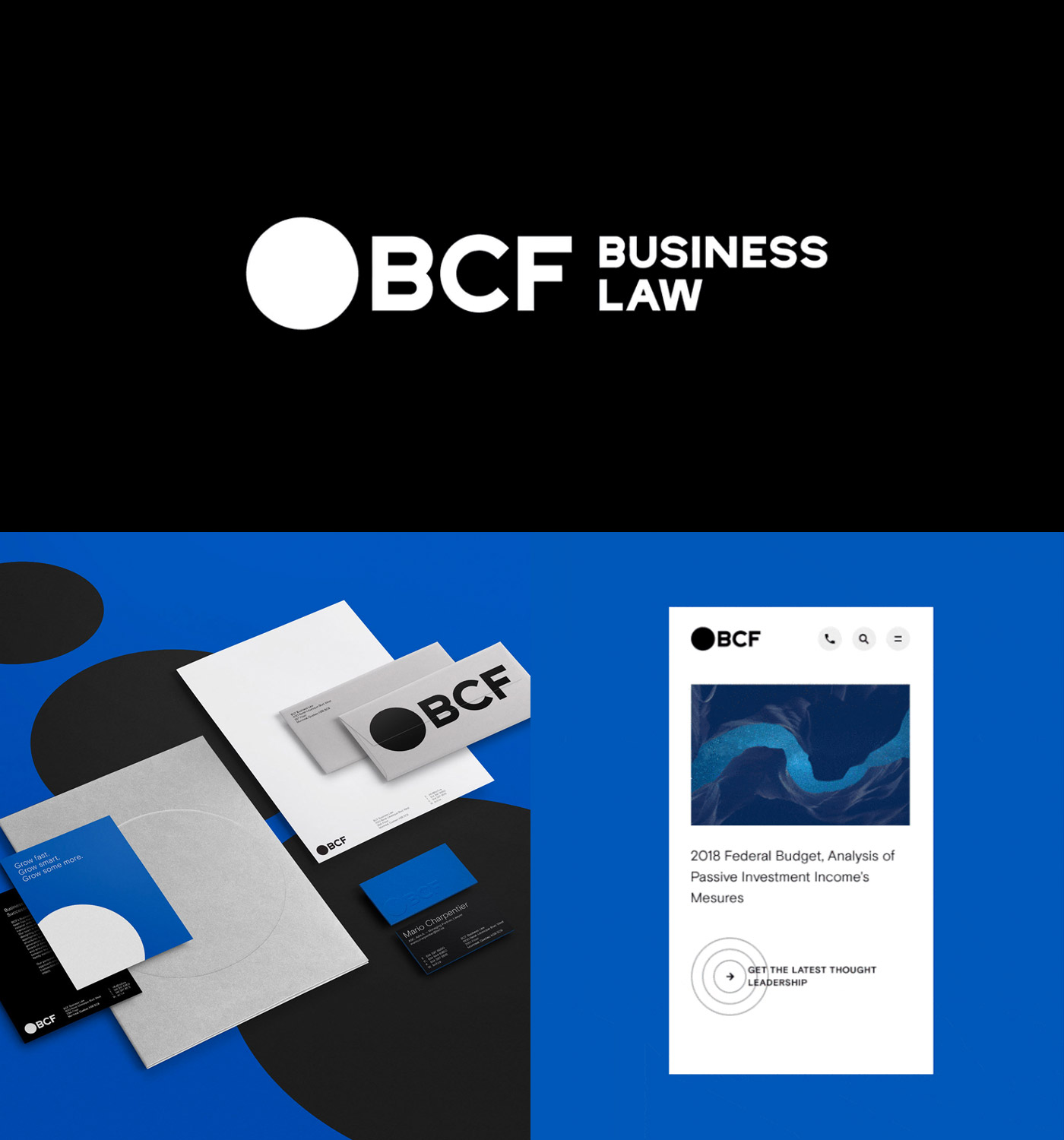
BCF Designed by Lg2
A simple logo can be the inspiration for so much more. A cohesive legal brand identity is something that should entice current and potential clients while being memorable and impactful. In this case, Lg2 has captured the perfect synergy of branded elements. The bold static logo is designed to be used within a larger family of branded elements curated across all of the unique platforms of the firm.
Modern Take on Traditional
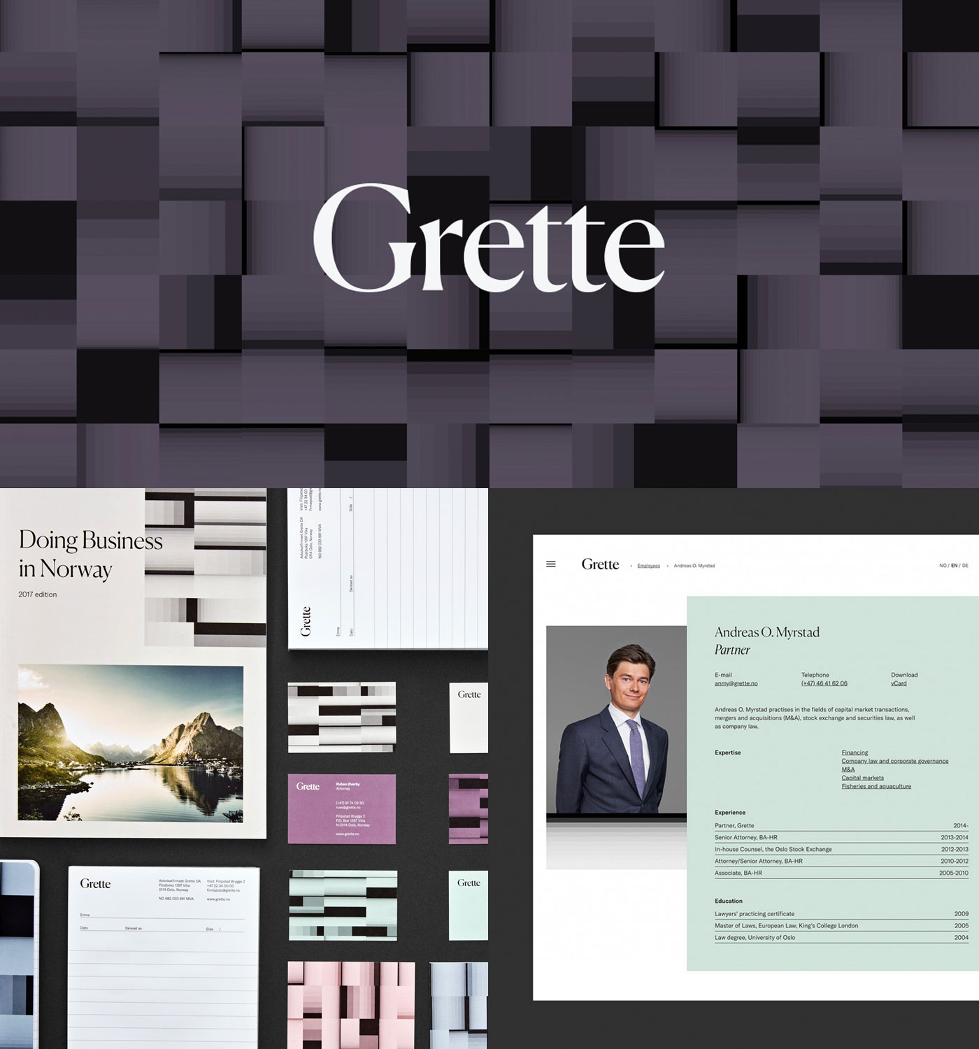
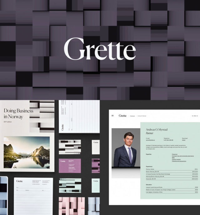
Grette by Snøhetta
This is what happens when a truly design-focused team is given creative license to brand a legal firm. The subdued and elegant colour palette perfectly balances with the forward thinking, complex pattern that encompases the complete brand identity. Grette’s rebranded logo is purely typographical and draws in classical typography styles that contrast with the modern sans-serif used across other branded elements. This new brand identity showcases just how a corporate law firm can become a strong, artistically visual experience based on concept and vision.
A Friendly Approach
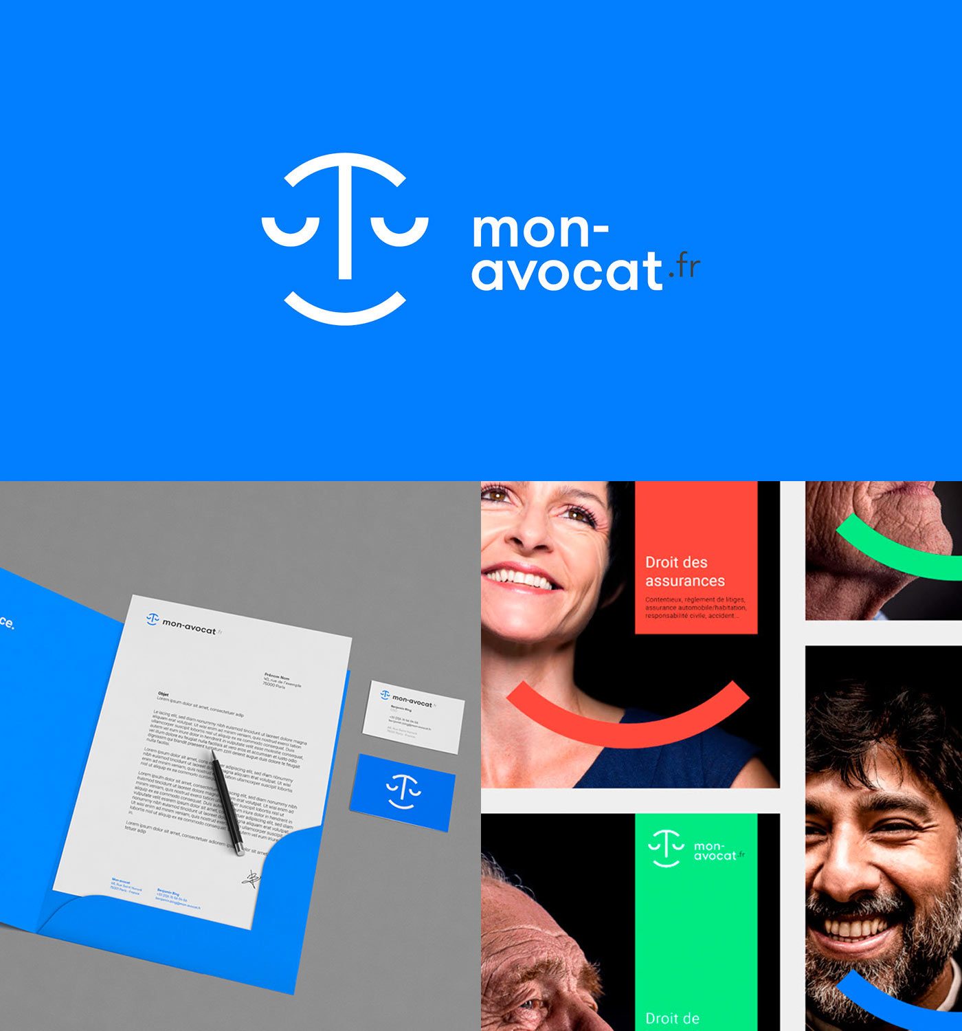
Mon Avocat Designed by Graphéine
Mon Avocat branding is instantly recognized from its friendly graphic elements. From start to finish, Graphéine was able to design a cohesive brand identity to be used across all media. From the branded colours, typeface and enticing twist on the classic scales of justice, this is a great example of fresh and modern lawyer branding.
A Branded Message
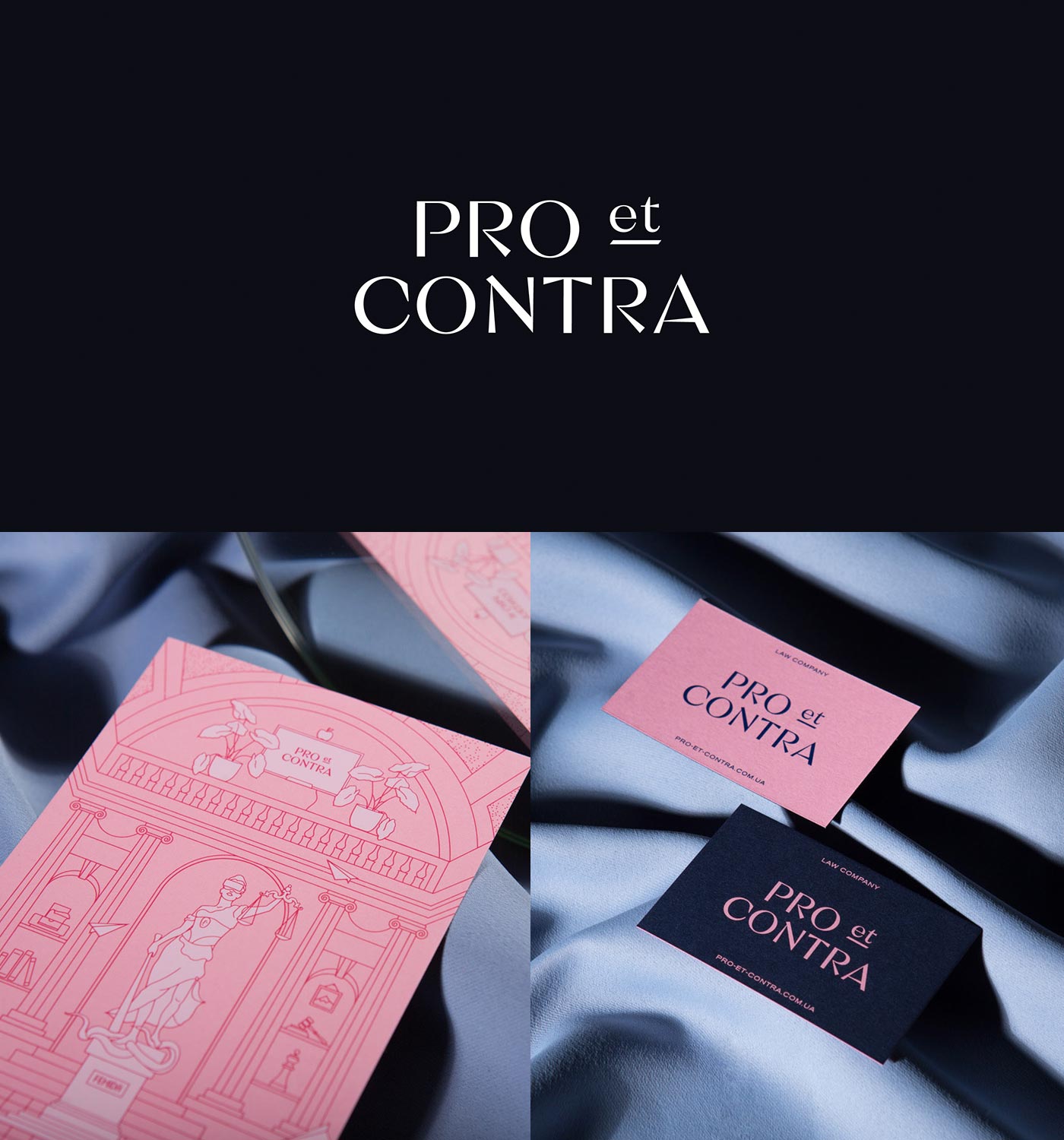
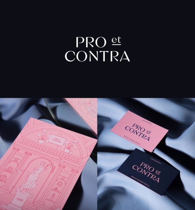
Pro et Contra Designed by Other Land Studio
A law firm’s voice and message can help define their brand. Other Land Studio was able to turn this lawyer’s branding objective of being benevolent yet elegant into a cohesive branding system with playfully balanced contrasting colours, unique typeface and custom graphics. Pro et Contra is a great example of how simple branding can shape your law firm’s identity, stepping away from classic firm design staples and uncovering a modern, streamlined brand family that resonates with, and entices, future clients.
Confidently Classic
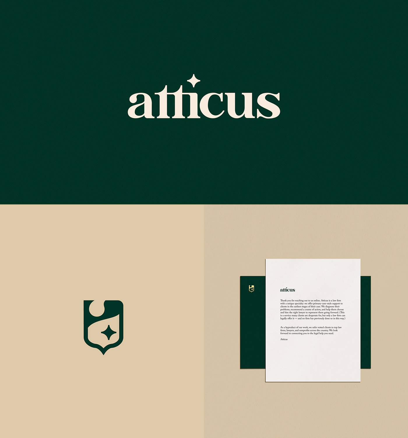
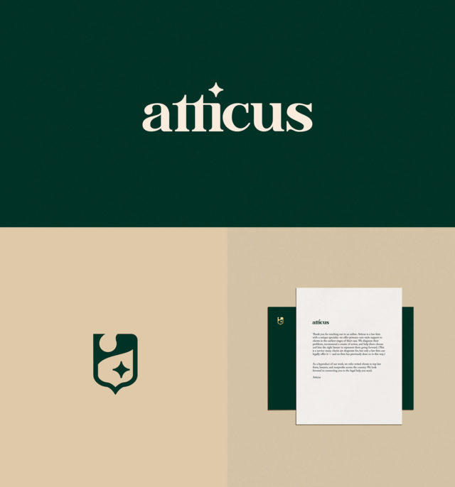
Atticus Designed by We Are Lazaris
Having bold branding is not something reserved for big city law firms. The brand system for this small town law firm establishes their tone of voice right away. The custom logo type and modern sans-serif play up current trends while remaining true to the law firm’s ultimate vision.
Visual Messaging
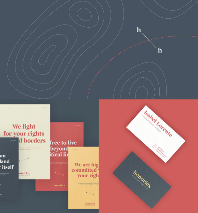
Honorlex Designed by Salvador Serrano
Legal stock photos have become a common way to visually represent a firm’s core practice areas however, it is not the only way. Honorlex Law Firm specializes in international family law and its thoughtful branding focuses on the borders that define that practice area. Creatively using topographic maps, borders and custom graphic elements, this legal brand design takes you on a unique experience through its graphic messaging without clunky stock photos.

Setting a New Tone
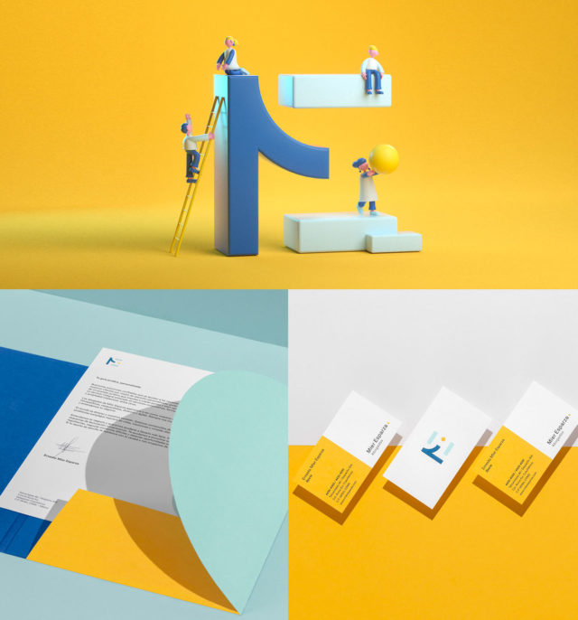
Mier Esparza Designed by The Branding People
A law firm needs more than just a logo, but rather an innovative identity and tone of voice. The Branding People successfully created Mier Esparza’s brand to be utilized across all platforms. Vibrant hues, creative logo mark, branded animations, and printed assets allow this complete lawyer branding solution to stand out from competitors and attract potential clients with a unique experience.

Minimalistic Sophistication
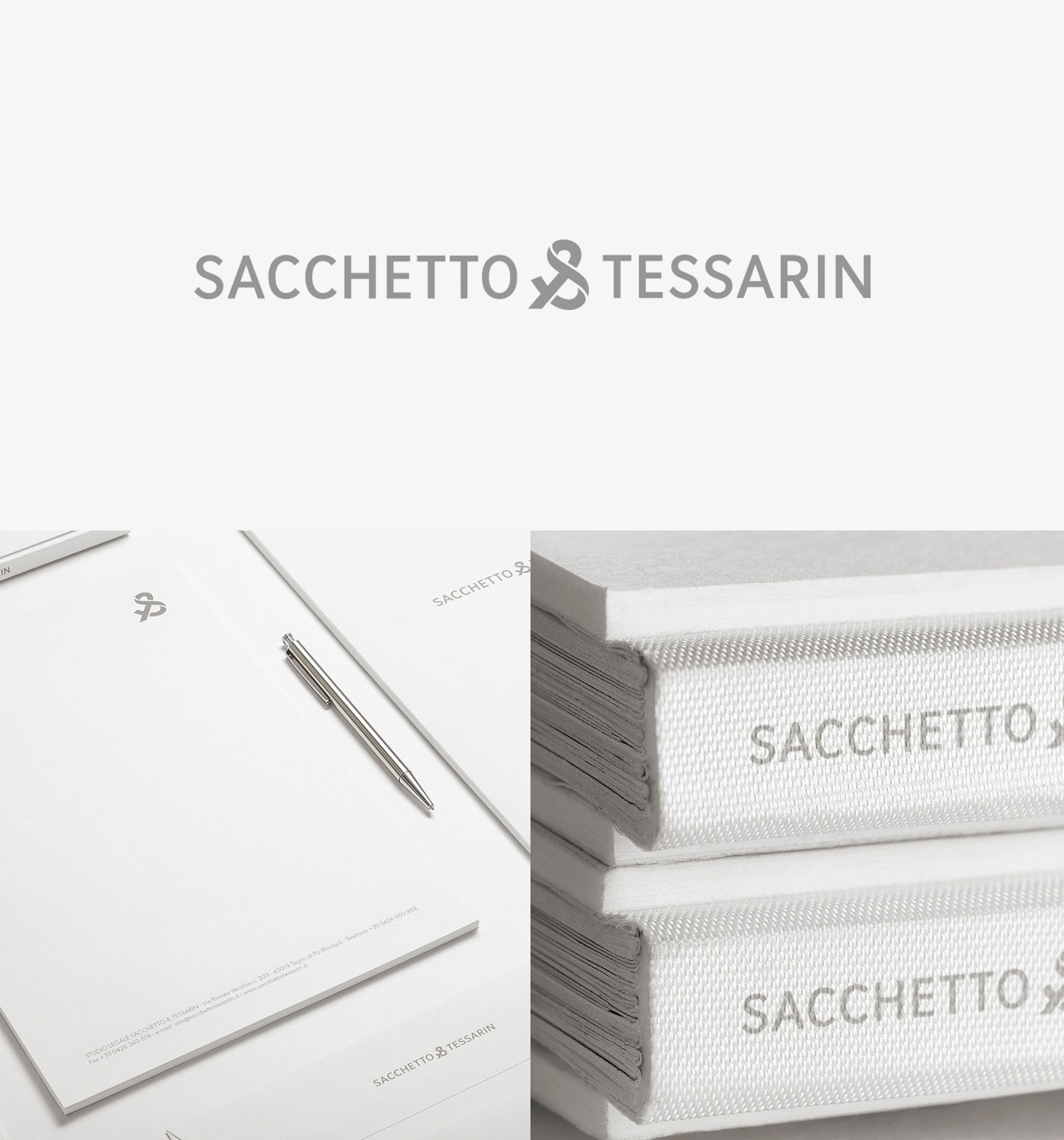
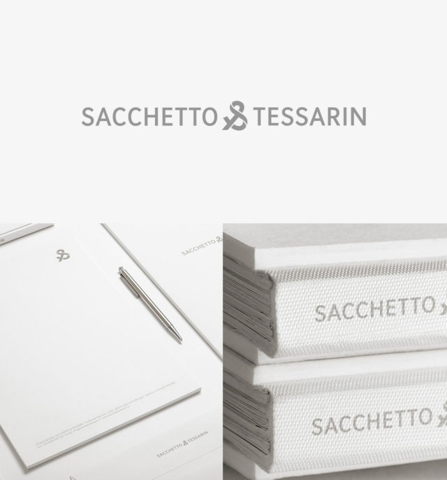
Sacchetto & Tessarin Designed by Concreate Studio
A law firm’s tone of voice should define the brand’s messaging and vice versa. Lawyer branding does not need to be punchy and bold, it simply needs to encompass the visual identity that makes your firm stand out amongst the competition. Taking this minimalistic approach, the clean letter forms, soft tones, and custom ligature resonates with this firm’s clients and stays true to their core messaging in a modern and timeless way.
Strong & Credible
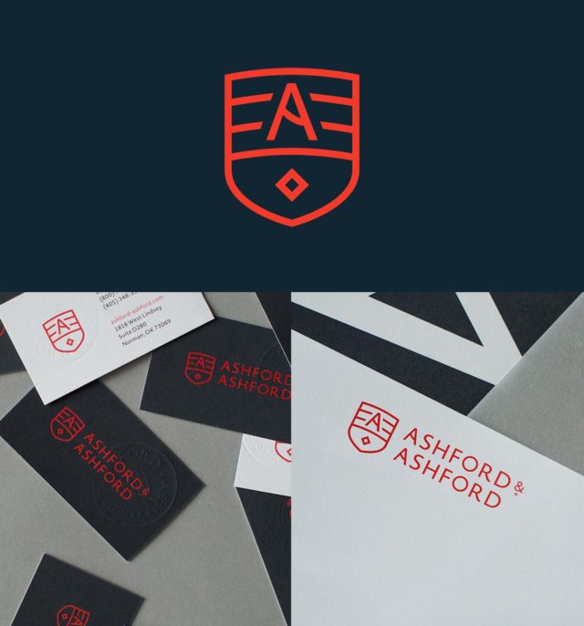
Ashford & Ashford Designed by Joel Schierloh
Certain law firms can stand out with crisp letter forms, while others can be expressed through a unifying logo mark which encompasses their firm’s specific practice areas. Ashford & Ashford’s brand design is based on credibility, stability and dependability and that is demonstrated through its holistic logo mark breakdown of branded element layers.

Loud & Minimal
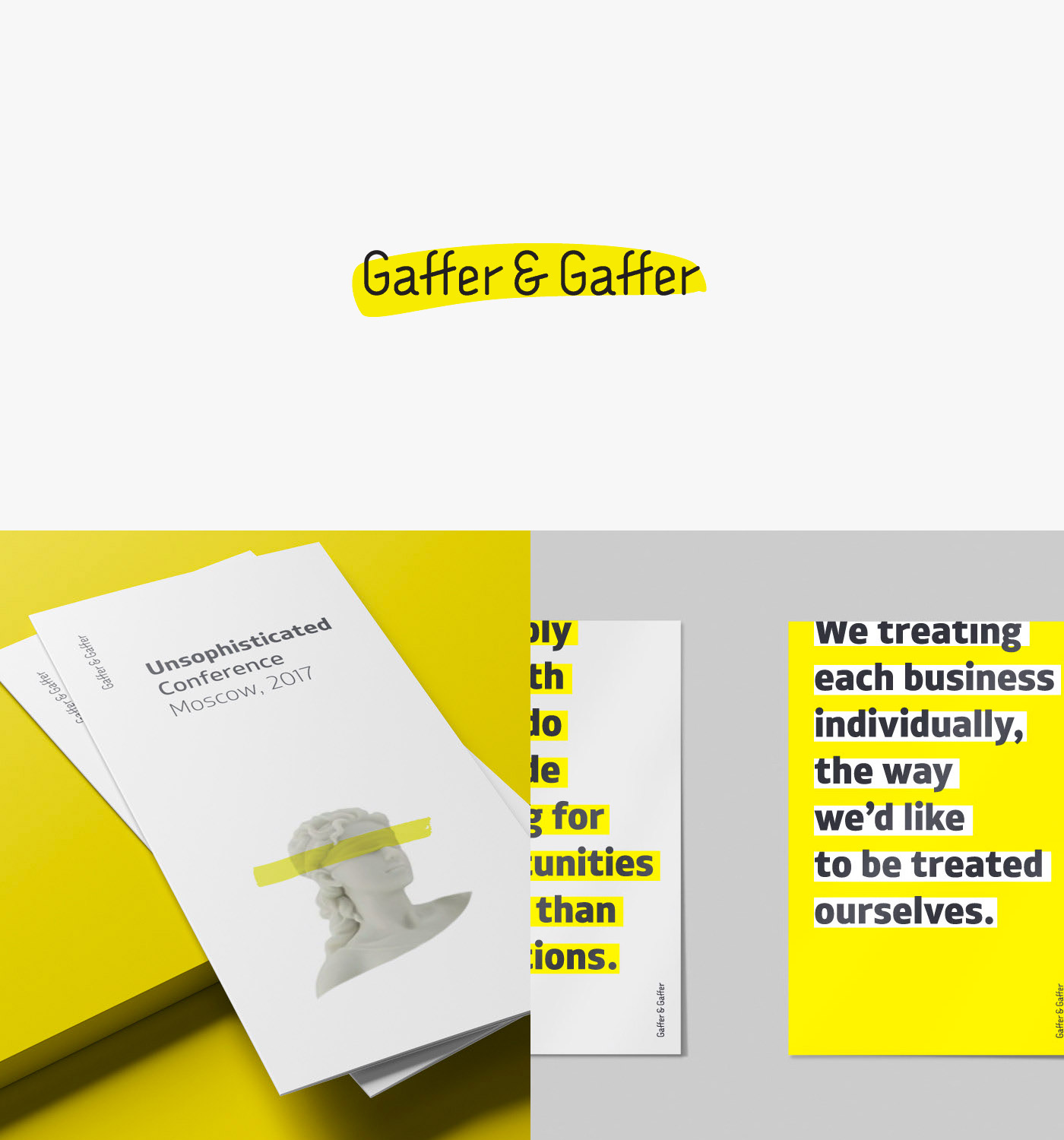
Gaffer & Gaffer Designed by Aleksey Busygin
There is something to be said about a clean typeface and a vibrant accent colour – the opportunities are endless. Gaffer & Gaffer did not want to be branded as “just another law firm” and it shows. The clear branding that went into this demonstrates just how far it can go. The branded identity clearly showcases the approach of “finding solutions” with the highlighter design, organic hand-drawn elements and clean typography.
Bold Simplicity
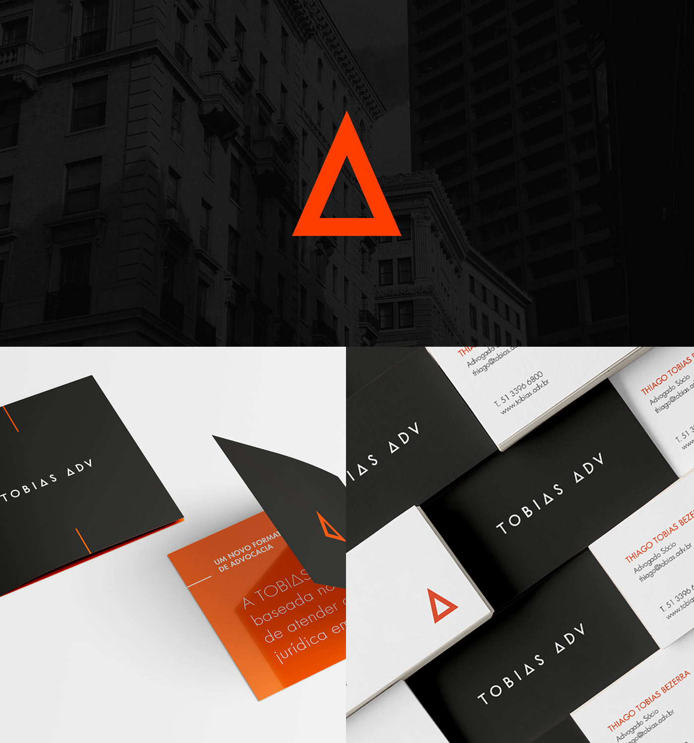
Tobias Adv Designed by Studio Bah
Thoughtful design planning can lead to a really clean and sophisticated look. Studio Bah has completed a slick and modern brand identity that is easily and seamlessly versatile across web and print materials. Strict brand guidelines including a clean typeface, use of shapes as branded letterforms, and a dual colour scheme allow this law firm to be visually dynamic and stand boldly among its competition.
A Personal Legacy
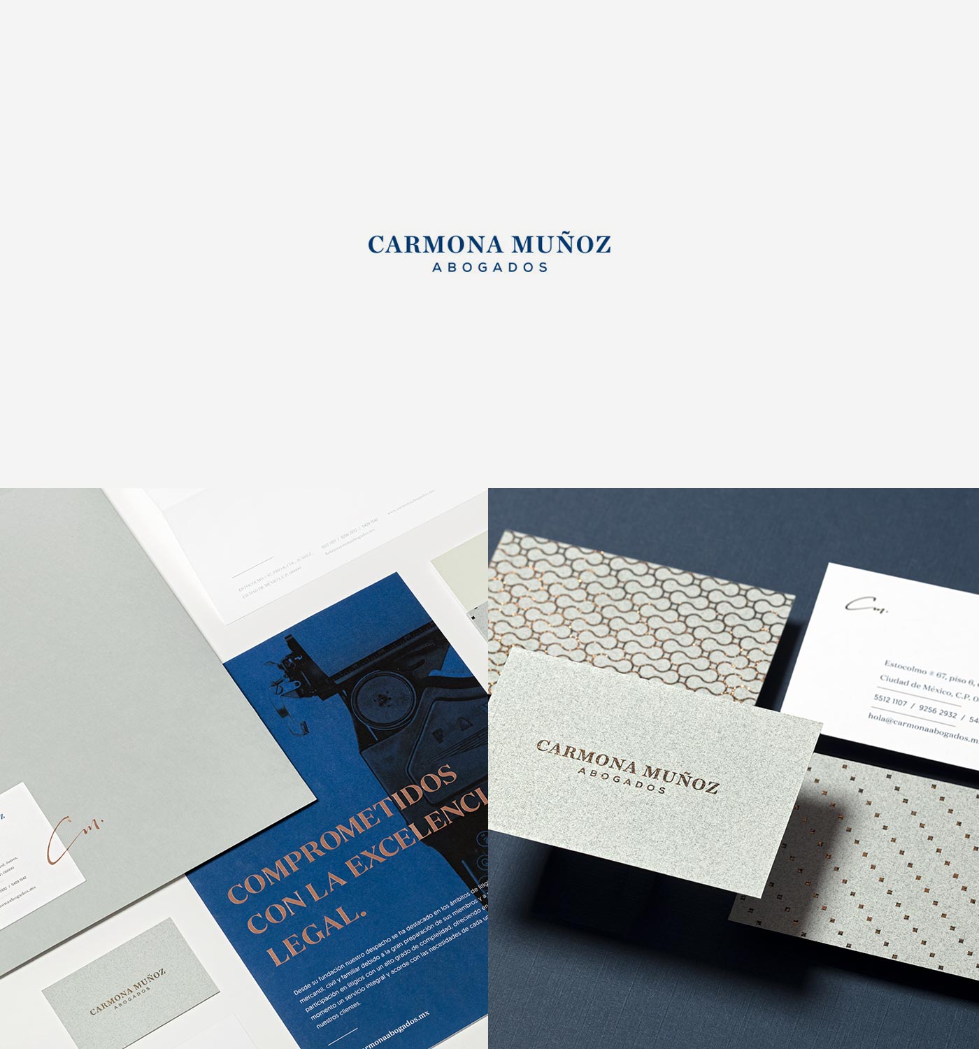
Carmona Muñoz Designed by The Branding People
A legal firm that has been through many generations could result in a branding rut. It is important to both your firm and its clients that your legal brand reflects the past and future. The Branding People were able to pull inspiration from the heritage of this firm and create a complete rebrand. The emphasis on timeless fonts, bold colours, contrasting textures, and the organic signature accent all complement each other in a memorable and sophisticated way that will represent this firm for years to come.
Casual Refined
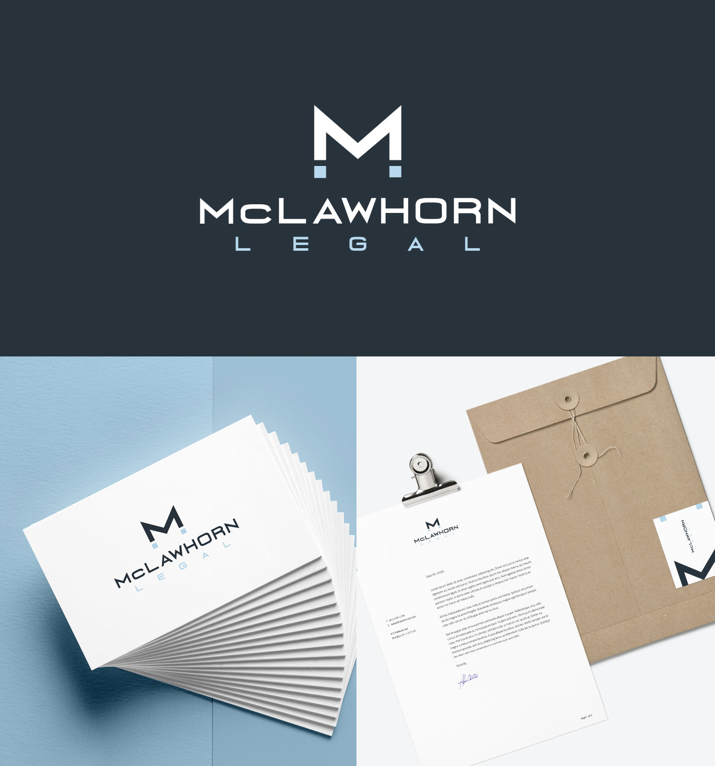
McLawhorn Legal Designed by Beam Local
Stemming from the legal symbol of scales of justice, the lawyer branding designed for McLawhorn Legal offers a subtle nod to this notion which is emulated through the letter M logo mark. Custom designed elements such as this add up to a complete branded system of elements which translate to other mediums to form a cohesive brand identity. The subdued and rich colour scheme presents well within the logo and balances well with the modern sans-serif font.
Are These The Best Lawyer Branding for 2020?
Click here to find out how you can attract better clients for your legal practice.





Let an expert guide you.
Beam Local helps professionals launch better websites, outrank their competition on Google, and attract better customers for their businesses.
Or Call +1 (855)-831-4530 and Ask for Kyle
