Best Lawyer Website Designs 2017
NEW / The Best Lawyer Website Designs of 2021
As a team we spend a lot of time researching legal website design. We understand what it takes to design and build a beautiful, performance driven website for the legal space. As a follow up to our popular post on the best lawyer websites from 2016 we’ve created a fresh new list of the best attorney website designs for 2017.
If you’re interested in having a new website designed for your legal practice please get in touch for a free consultation with our team at Beam Local today.
Westaway
An innovative legal website design which attracts innovative clients.
It seems like many lawyers want to be ‘innovative’ in their approaches especially when it comes to websites. The team at westaway.co seem to have actually adopted some innovative approaches including published pricing for both flat and subscriptions as well as targeting a very innovative client base a la Warby Parker among others. This law firm website design leaves us feeling comfortable and confidant.

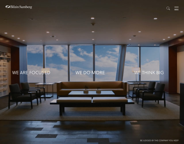
Bilzin Sumberg
This law firm website uses a full screen video, with a very simplified menu.
The initial homepage is a nice lead into what becomes a very deep and catalog driven website. It would seem to me that Bilzin Sumberg spent a large amount of money on their SEO strategy as the sheer volume of keyword rich pages and internal site links is almost overwhelming for an actual user. Maybe they went too far it, maybe not… you decide!
Procopio
A big bold law firm website design that stands out from the competition.
They use a powerful and well produced intro video which we would have preferred to see integrated into the design of the website more instead of just playing in a modal window. Overall really effective and responsive site for a bold legal website.

Arnold & Itkin LLP
Sometimes website designers can get a little carried away with their lawyer website designs.
I feel like this might be one of those times. It technically has it all… Nice big images, good page layouts, and a nice (albeit predictable) colour scheme, but I feel like it’s just little too much information on the homepage. With sites like this one often find myself racing to scroll through the whole page just to see how many sections are actually on the site. Maybe I’m being too harsh… It might grow on me. I’m sure the partners at the firm love it which I guess is the main goal.

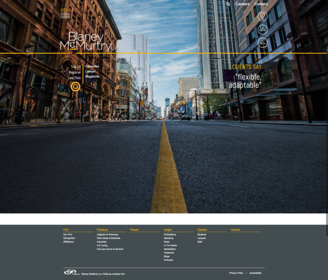
Blaney McMurtry
This legal web design feels like it was designed by a company who hasn’t really adopted a framework.
Anytime you see a site with a menu you’ve never seen before, chances are they probably shouldn’t have used some unique new menu. The Lightbulb, +Social and +News links are interesting but combine that with a hamburger menu and it feels like the wanted a minimalist law firm website design but might end up just frustrating some users.
EB Law
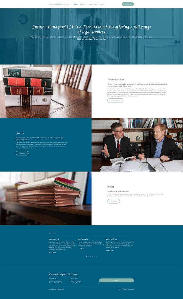
This Toronto law firm website design is simple and straight to the point.
The colour scheme is a fresh and modern approach for a legal practice site design and we’re happy to see it working on all devices, responsively, with no issues.
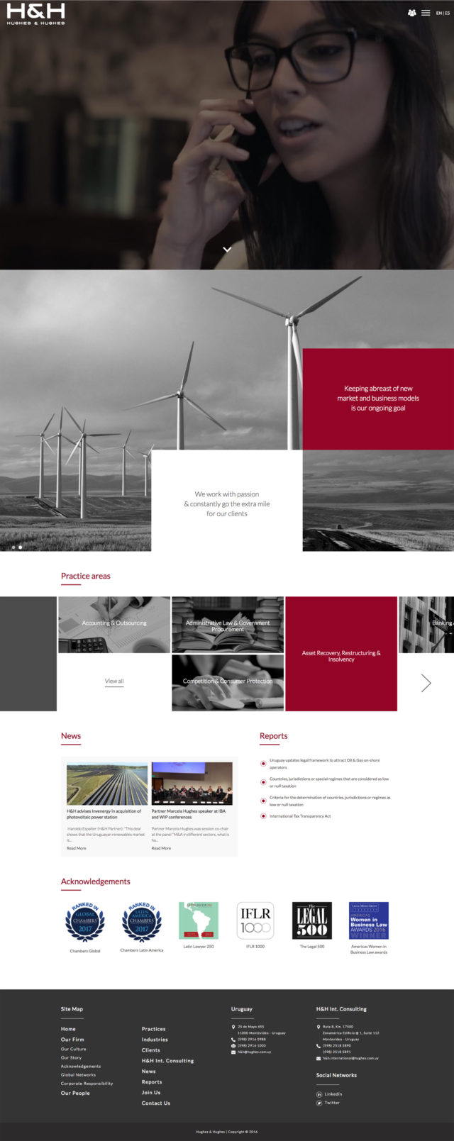
Hughes & Hughes
A corporate law firm website design which comes across as professional and business focused.
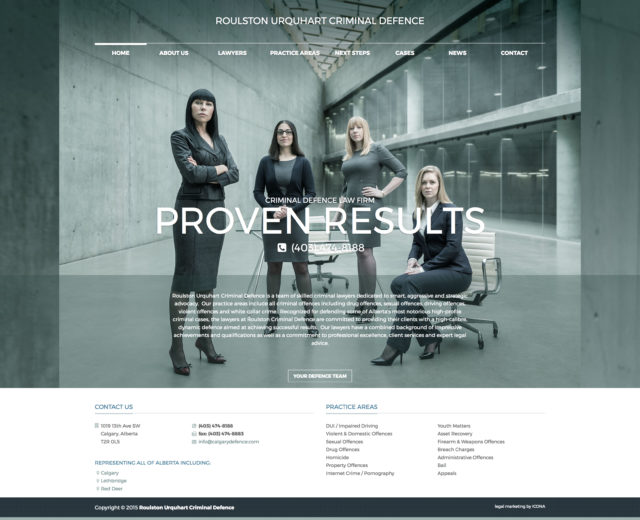
Roulston Urquhart Criminal Defence
Powerful header image, moody toning, makes the partners feel omnipotent.
Bick Law LLP
This is like flipping a cliche on it’s head.

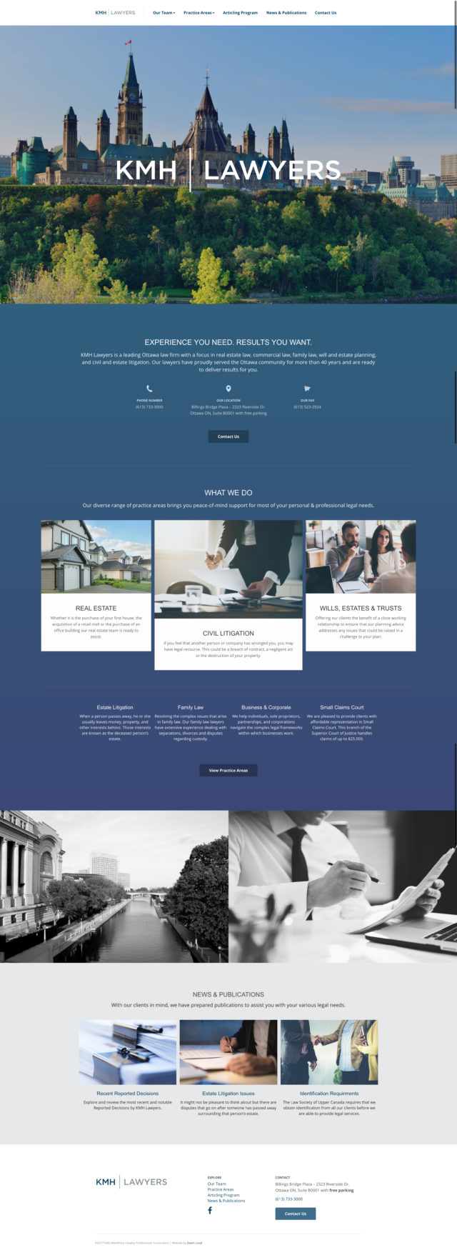
KMH Lawyers
This Ottawa based law firm has a website design which is bold and engaging.
Let an expert guide you.
Beam Local helps professionals launch better websites, outrank their competition on Google, and attract better customers for their businesses.
Or Call +1 (855)-831-4530 and Ask for Kyle
