10 Best Architect Website Designs for 2016
We took the time to view over 1200 architect and architecture firm websites on the internet. This is the definitive list of the 10 best architect website designs for 2016.
It’s not surprise that these sites are all relatively modern, and clean looking. It seems like modern architecture translates well into these architect website designs which allow the architecture to tell the story.
If you want to get a website for your architecture related company, or if you like us to grade your site for free just shoot us an email at support@beamlocal.com and we’ll take a look.
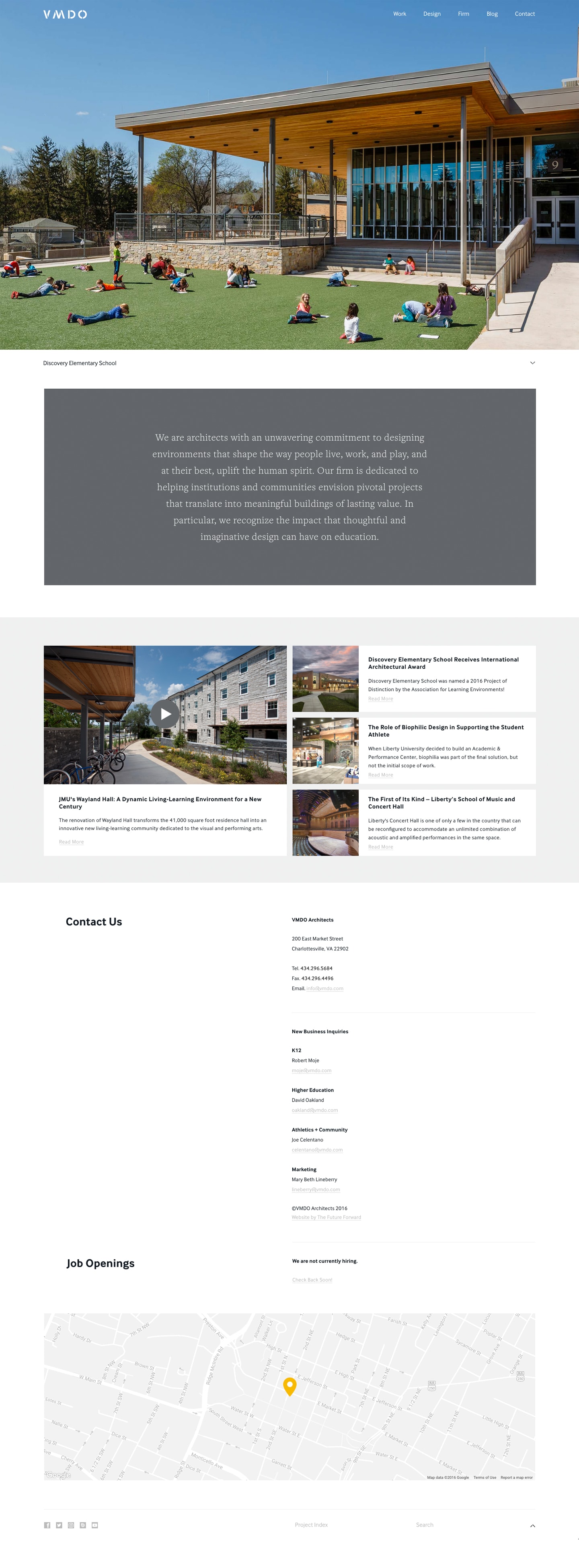
1. VMDO Architects
Why we love it.
A well designed architecture firm website should help communicate the spirit of the firm, while still allowing the architecture to speak for itself. The VMDO website design is clean and straightforward, the large screen header images mixed with the well thought out descriptions add up to a great overall website design for an architect.
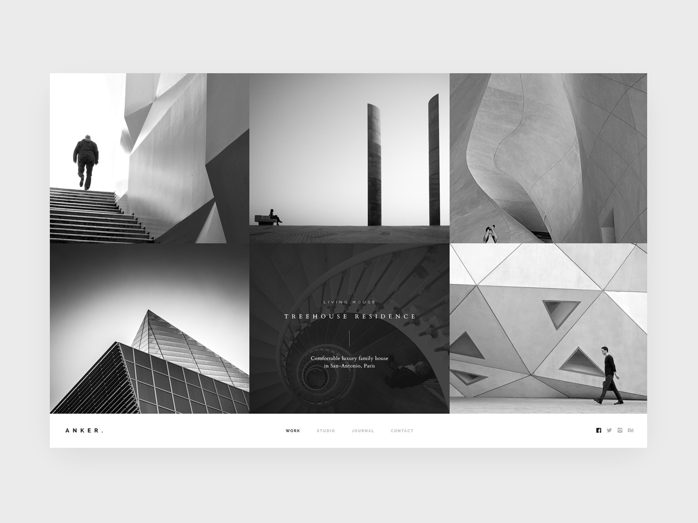
2. ANKER Architecture Studio
Why we love it.
Longer, complex, grid based website designs are definitely in vogue for 2016, and still on trend for 2016 so it’s nice to see a site scale down the height and spend more time thinking about device viewports. This architecture web site feels like a very well constructed interactive presentation.
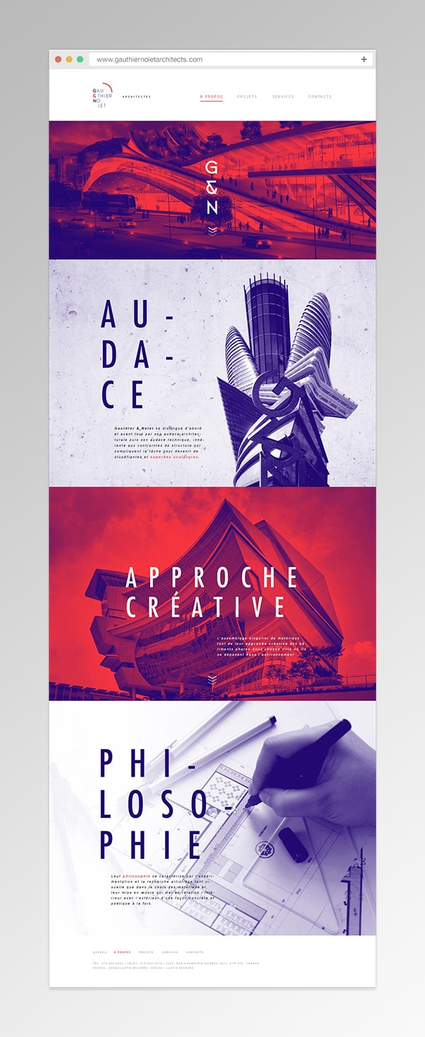
3. Gauthier & Nolet
Why we love it.
We’re a little biased when it comes to Canadian website design, so it’s nice to see this site make our list. It’s punchy, and tells a very memorable story. It’s also nice to see a company push their branded design personality past everything else which ends up being very simple and bauhaus feeling.
4. HOW arkitekter
Why we love it.
Leave it to the Swedes to come up with a way to infuse colour into well basically everything. It’s refreshing, fun, and engaging… makes me want to go to Ikea and play in the ball pit. This is what an architecture website should strike to become.

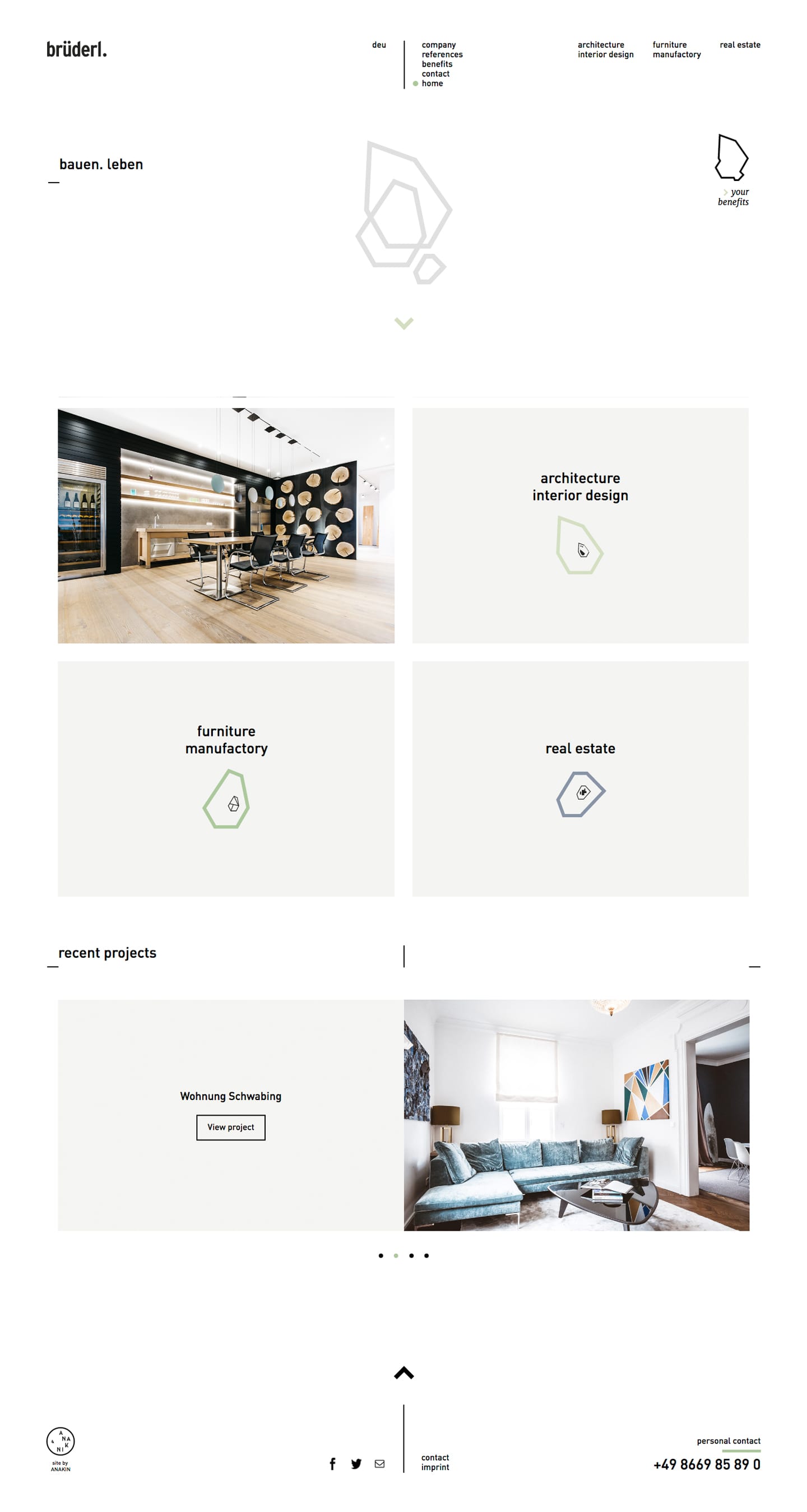
5. brüderl Gruppe
Why we love it.
You can tell this site was carefully, almost painstakingly thought out. All of the spacing and type is set ever so purposefully. You can tell this architecture firm cares about detail simply by visiting their website.
6. ATAAHT Architecture (Concept)
Why we love it.
This is a concept website design for an architecture firm, but it’s very forward thinking in it’s design, and colour palette. If you’re looking for inspiration for what the future of architect website design holds this site might be a perfect harbinger.

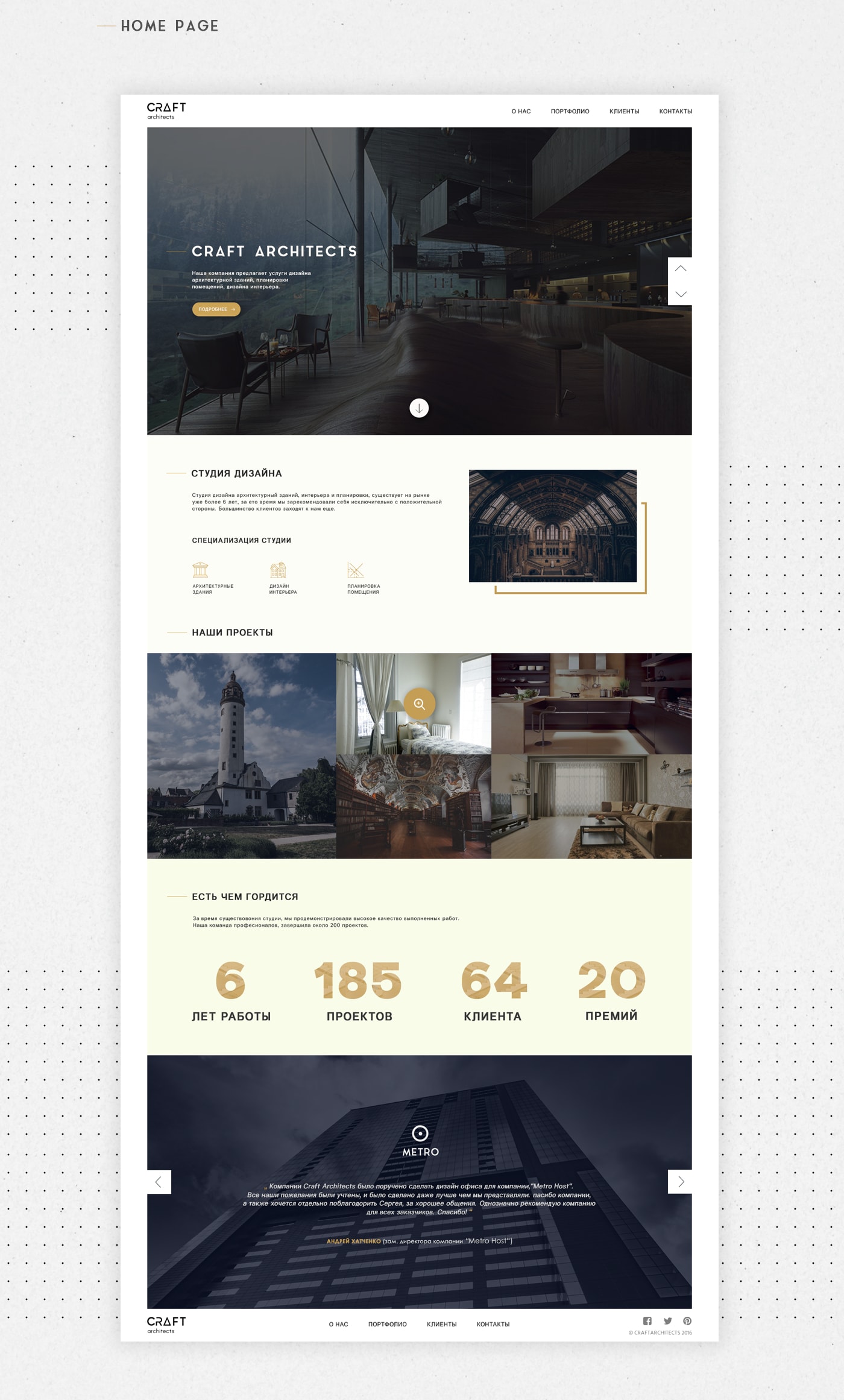
7. Craft Architects (Concept)
Why we love it.
This website encapsulates most of what 2016 meant for website design. It’s clean, professional, grid based, and easy to navigate. It might be lacking a little personality but it makes up for that by being exceptionally functional for a architecture firm website design concept.
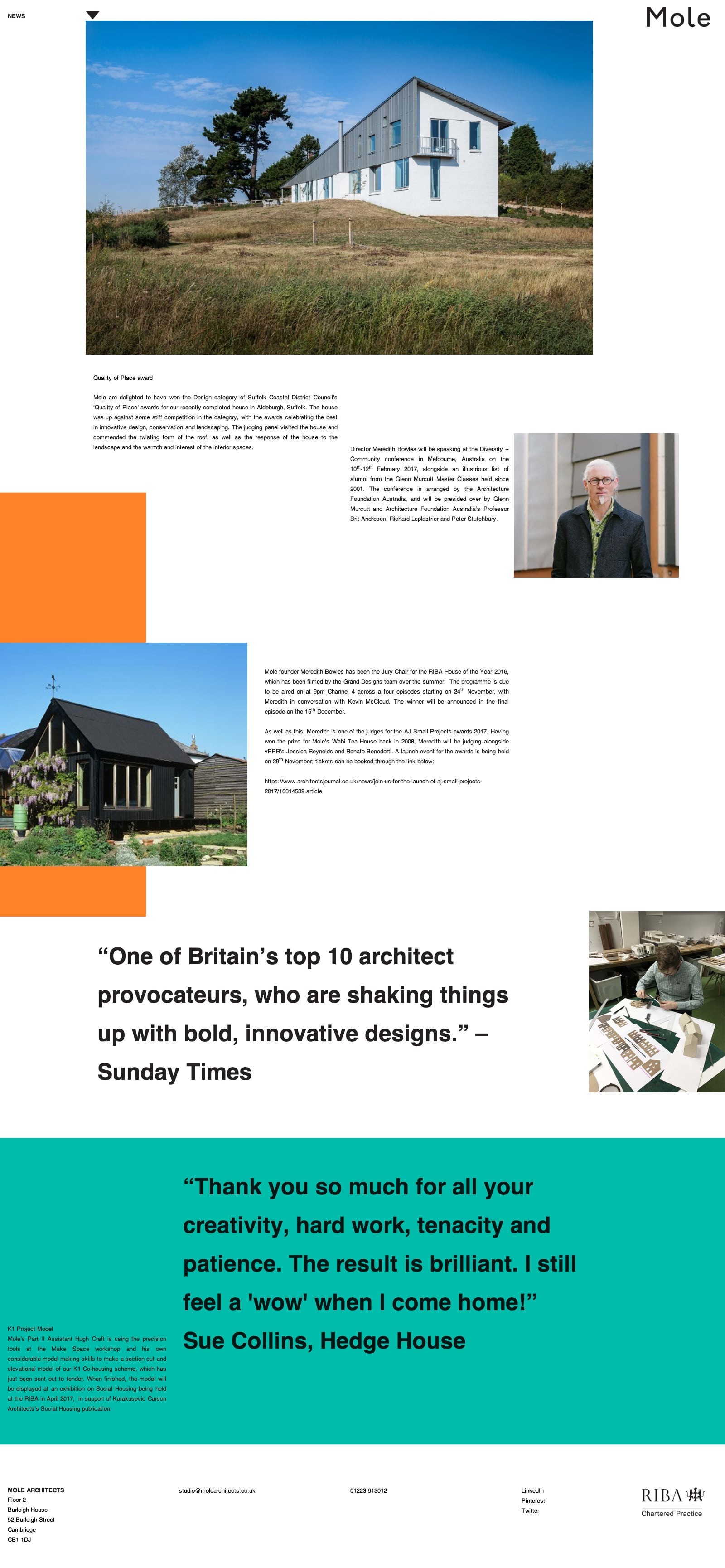
8. MOLE Architects
Why we love it.
We know that using social proof, and building trust on your website is important so it’s great to see this architecture firm website use a mixture of quotes and personal photography to help tell their story. It’s a very well designed website which stands out amongst even this top group of architect website designs.
9. Red Architecture
Why we love it.
The Red Architecture website gets extra points with us because their architecture is well, awesome. Having a site which is simple a well laid out collection of your projects works IF your projects are awesome. In this case the website design for this architect is perfect.

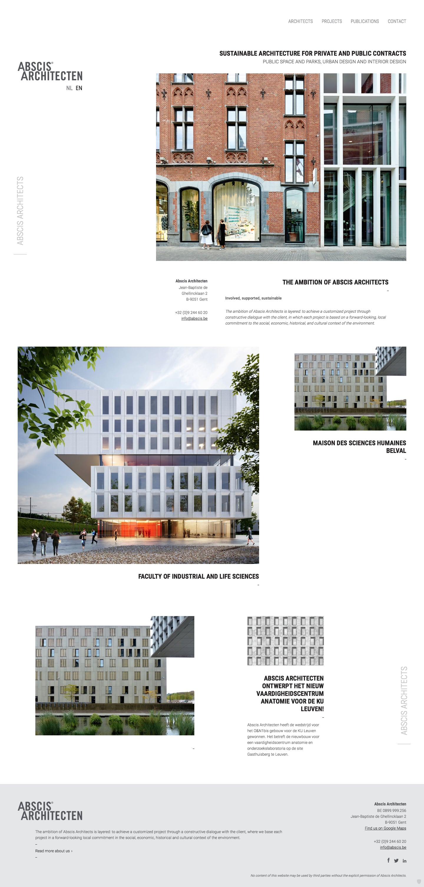
10. ABSCIS Architecten
Why we love it.
This architecture firm has a website design which feels like the prototypical design for an architect who wants to be taken seriously. You can tell at a glance that they do great, big, work.
Let an expert guide you.
Beam Local helps professionals launch better websites, outrank their competition on Google, and attract better customers for their businesses.
Or Call +1 (855)-831-4530 and Ask for Kyle
